Hello!
My name is Derek John Thomas, and I have lived and worked in South Korea since 2002. Through my work and experiences here, I have gained many insights and new understandings at the intersection of Eastern and Western culture and spirituality. My purpose with this site is to share what I have learned and continue learning. My primary interest is spirituality, but I will also share any healthful recipes and other food related information.
My spiritual journey began with my baptism into the Roman Catholic church as a baby. It has taken many twists and turns to get me where I am. I have studied theology in graduate school, and I have continued to study and broaden my understanding while living in South Korea. While I still identify myself as Roman Catholic, I also see the truth that is in all religions and spiritual traditions. My understanding now is that of Oneness. Stated simply, all is in essence One Source manifesting in diversity.
As for food, I have always been interested in cooking and nutrition. As with life experience, I believe diversity in our diet is essential. I try to find foods that are as socially and environmentally just and sustainable as possible. I also avoid industrial processed food as much as I can.
I welcome you here with an open heart and look forward to our mutual evolution.

About the Logo
The Shape
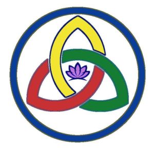
The main form of the logo is a variation on the Triquetra which is a Celtic knot. Another name for it in Celtic Christian culture is the Trinity knot. The three loops symbolize the Holy Trinity of Father, Son, and Holy Spirit in Christianity. As the central knot is a continuous line, it also shows the indivisible relationship of each Person of the Trinity, and there is no distinct point where one Person of the Trinity begins or another ends. The encompassing circle serves to emphasize the unity of the Trinity as one God. In my logo, I am extrapolating from the Trinity of God to have the knot symbolize the divine attributes in each of us. Each of us is the same intrinsic essence of the Divine Creator. So, the knot in the logo is our divine nature which emanates within God.
The lotus in the center is borrowed from Hindu/Buddhist culture. In Hindu art, the lotus is a symbol for Vishnu, and Brahma, the creator god, also appears on a lotus. The lotus is a flower which blooms from muddy waters. In Buddhism is symbolizes the enlightened person manifesting from the mud of attachment and desire. For the logo I have appropriated it to be a symbol of both Divine and individual consciousness: that from which this physical universe has been formed.
The Colors
I selected the colors from a variety of cultural sources. Green reminds me of the life force and well-being of the planet, and so green is symbolic of Wellbeing. In East Asia, yellow and gold are colors of happiness, so in the logo it is a symbol for Joy. Red has always been the color of love for me, so here as well, red is the symbol of Love. I drew the blue/indigo in the circle from the color of the third eye but even though it may look more like blue that is alright. Blue is the color of wisdom, and intelligence, so the blue/indigo represents the unifying Awareness that is in and encompasses the other three qualities of Love, Joy, and Wellbeing. The violet of the lotus stands for the crown chakra which is the connection with the Divine. So here it is the union of the Divine and individual spirit and states.
